Learning is fun – The Seven Minute Star Seminar at GILD Club Barcelona
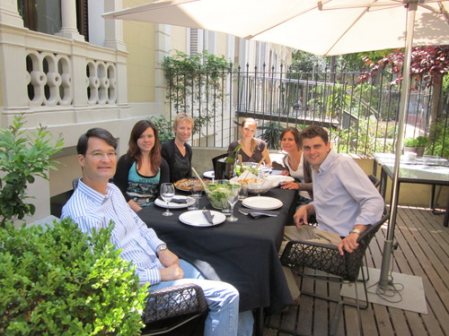
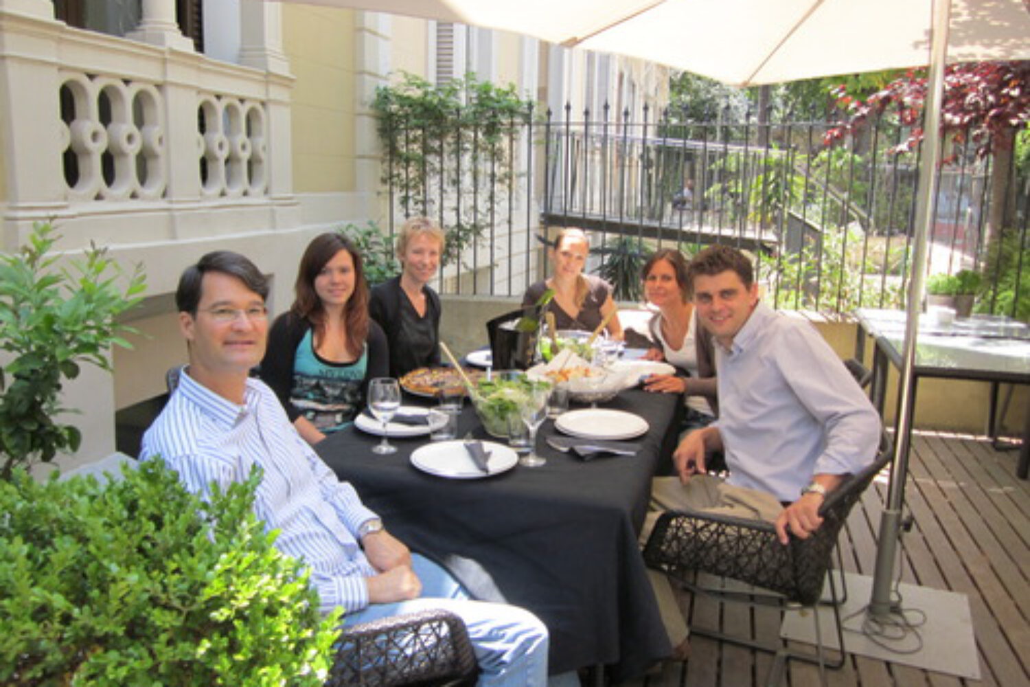
Yesterday I dedicated a second session of The Seven Minute Star Seminar to Powerpoint. My super agile seminar crowd made up of representatives of theCommercial Delegation of Austria in Barcelona had received some homework after day number one: to create a five-slide Powerpoint presentation (intro-A-B-C-closing) about a project of their choice. In my seminar we then scrutinized all presentations together – we unleashed more POWER in our POINT.
I did that for the first time, but it turned out a great learning experience for everyone.
Here are two of the key learning points:
.
Think In Boxes, Not In Bullets
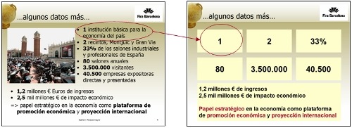
It’s amazing to see how people stick to their bullet points. But once they saw the direct comparison, all participants acknowledged that being creative, for example, with boxes and reduced text messages is much more powerful than using bulleted sentences:

I asked them why they use bullet points and in unison they confirmed that it is more a question of not forgetting anything. Meaning, bullet points give them security content-wise. My answer was that if you don’t know your topic well enough to talk about it for five minutes, maybe you shouldn’t speak about it in the first place.
A trick I always use, especially with number-based or statistical data, is to put the numbers in boxes (see image above). That way the audience stays curious about what you will say and you include some hidden hints on the content side.
.
Use Beautiful And Large Images
It’s also amazing to see how people treat images in their presentations. I guess the biggest mental shift people have to make is say good bye to the one-stop presentation. They want the convenient package – projected and printed presentation at the same time. This does not work!
In a Powerpoint print-out version readers don’t want to see large images only. They want to find facts and figures, data and convincing written arguments.
In a projected Powerpoint version on the other hand viewers don’t want to read what the presenter says. They want to see beautiful supporting images, visual anchor points embracing the speaker’s messages.
Beautiful large images are great, for example, for the first slide. Just like you do not mention your name and who you work for in the first sentence, make sure you do not put that information on the first page. Yesterday participant Margit started her presentation heading for the right direction. But given that she began her speech with a reference to Columbus and his exclamation that he had discovered the most beautiful place in the world (Cuba), she could have gained more impact showing a single, beautiful and large image:

Beauty is in the eye of the beholder. Beauty will always be subjective. Still – audiences in general tend to be impressed by beautiful, large images. It’s a safe touchdown, don’t let escape those six points!
There are tons of ways to put more POWER in your POINT. I recommend you read Garr Reynolds’ bestseller Presentation Zen. Or you attend one of my seminars… 😉

