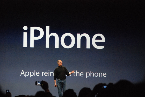
Beauty is in the eye of the beholder. It’s true, perception is a bell curve; every single one of us sees everything differently. Take a modern art piece. For some, it’s a con, for others it’s a new Michelangelo.
One concept though stands out for me. One concept will always cover a great portion of that bell curve. Da Vinci said it; Steve Jobs immortalized it – simplicity. Simplicity is the ultimate sophistication.
Can you picture Steve how he insisted on his one button iPhone?
But Steve, we can use two buttons…
No.
But Steve, if we only…
No.
But Steve…
No.
Imagine you have to present in front of an audience. Imagine how you create your slides. If you’re a follower of my articles you’ll know that I differentiate between handout slides (to be read) and screen slides (to be “heard”). But that aside, even if you create your normal corporate template mutilated slides, do you strive for sophistication?
Think about your presentation and that slide deck again. What do you see? Simplicity? How do these slides look like?
Numbers?
Many numbers?
Facts?
More facts?
Graphs?
Multiple graphs on one slide?
Border lines around your graphs?
Redundant descriptions of the axes?
Redundant slide titles?
Small images?
Several small images on one slide?
Several differently-sized small images on one slide?
Pixelated images?
Bullet-pointed full sentences?
Is that simplicity?
The one question that makes all the difference is, would Steve Jobs approve them?
Would Steve approve pixelated images?
Would Steve approve the use of non-matching color schemes?
Would Steve approve a slide full of bullet points, long sentences, numbers and data?
Beauty is in the eye of the beholder, but simplicity is beauty. Next time you create a slide deck for an important presentation, look at each slide and ask yourself this one question,
Would Steve Jobs approve it?


Comment (1)